
Benchmarking is a powerful tool to help you understand how well your system is resourced. When used well, it helps to clarify aspects of your system that need attention and will support your internal analytics efforts. Benchmarks provides the big picture view while your modeling work can fill out the details. In this article, we’ll look specifically at how to benchmark for station planning.
Pitfalls
There are pitfalls in benchmarking. If you don’t choose a credible cohort of comparables, you can open yourself up to charges of cherry-picking and thus undermine your planning efforts. It’s therefore important that you choose the right comparables.
We recommend that you choose a set of services that are similar along a number of dimensions. Population is important, but density, geography, and transportation access are too. Does your service area contain large tracts of rural or wilderness land. Is it split by a river or bay with few access points? Is it surrounded by services that can quickly provide mutual aid? Vancouver has more in common with Boston than it does with Seattle.
Obviously, you should choose services that have a similar operating model to yours. Is yours a fire and EMS service, or just fire? Are your personnel fully cross-trained or run separately. Do you staff career only, or do you have paid on call or volunteer members.
Now don’t get bogged down with finding the “perfect match”. If you ask thirty emergency services executives, they will all say that their service is unique. Try to find a handful of services that are similar to you in population density, geography, and service type.
The chart below shows the population density of a number of large north american cities.
Population Density (pop/sqm, 2016 data)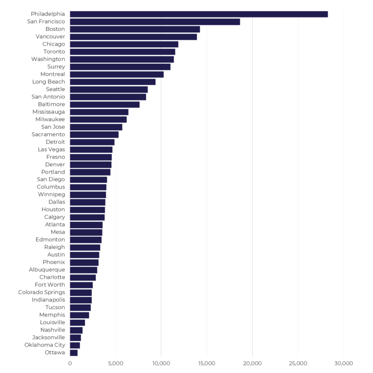
From this, you can already see different types of cities – the dense, water-bound places like Boston, San Francisco and Vancouver or the sprawling metropolises like Phoenix, Houston or Calgary. Layer onto this the ages of the cities, population growth rates, and other geographic features such as rivers or highways, and you’re well on your way to building a cohort of comparables.
Choosing the right measures
When engaging in benchmarking, it’s tempting to ask for the kitchen sink. How much does your cohort spend on training? How many call takers do they have? How do they treat alarm calls? Very quickly you will find yourself in a position where nobody will answer your questions. For station planning, limit yourself to only what’s needed.
At a high level, there is really only one question you need to answer when benchmarking your stations. You want to know how many stations you need to deal with your geography. Essentially, you’re trying to see if your stations are close enough to provide a timely response when you receive a call.
Now it’s tempting to try to use benchmarking to answer the “how many bays” question, but this is fraught with difficulty. First, we strongly recommend that you plan for small stations with only one or two bays.
Secondly, that benchmark data you need to collect is difficult to obtain. You would want to know the range of calls handled by a single station and more specifically, how many bays each of these stations has. We’re once again in kitchen sink territory. In looking at several hundred fire and EMS stations, we can say that within a single city, the calls handled by the busiest station may outnumber the quietest station by a factor of 100 or more.
A better approach is to plan for infill stations over time. As single family dwellings are replaced by high rises, look to add storefront and mixed-use stations to better deal with the risk of a denser population base.
Station Density
We recommend that you use the area per station as the measure of proximity. It gives you a rough estimate of how much land each station will have to cover. To calculate this metric, simply divide the total service area (square miles or kms) by the number of staffed stations. Note that for combined urban/rural systems, it may make sense to treat these separately.
For a dense urban area like Boston or San Francisco, you will get numbers below 1 square mile per station. For a more typical city unconstrained by geography (and with a more modern road network), it may be closer to 2 or 3 square miles per station.
In the chart below, you can see broad range station density of some of the major North American cities.
Station density (sqm/station, 2016 data)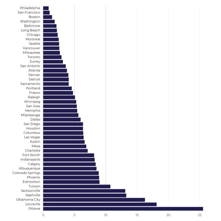
Hopefully this gives you a starting point in developing benchmarks for station planning.
In future articles, we’ll look at other measures that can be easily collected for other aspects of strategic planning.
If you have further interest in station location planning, we have also released our Station Planning Guide. Find out more here.